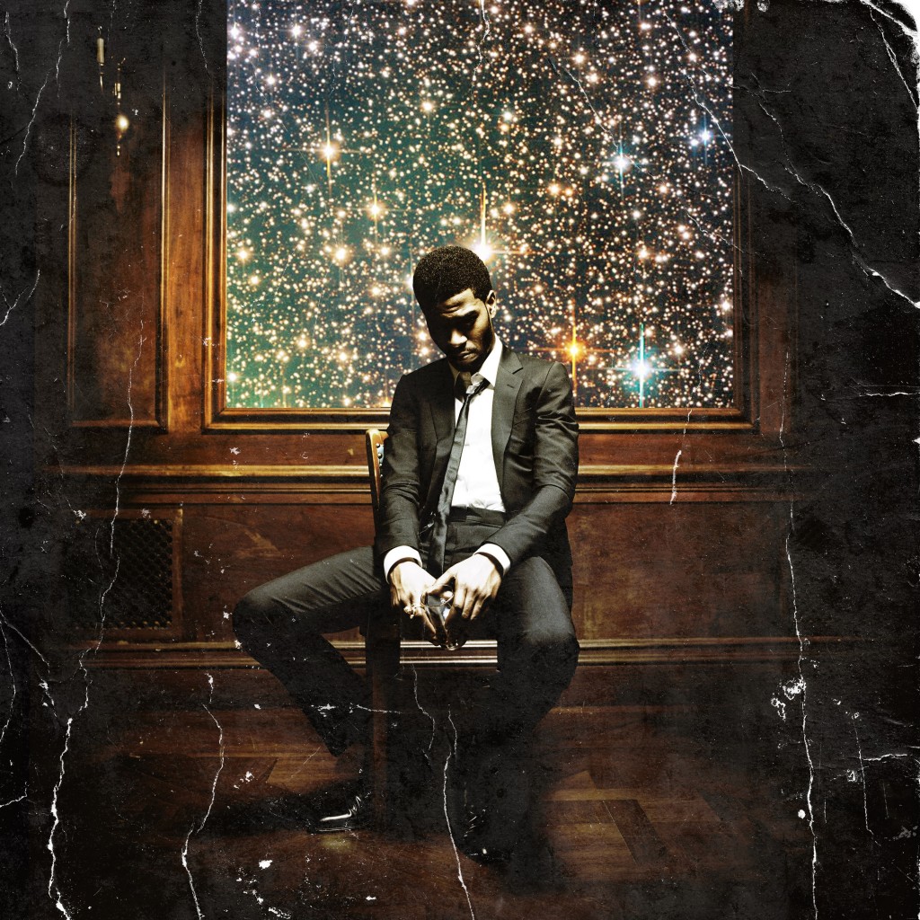
As promised, I plan on walking you through the marketing and promotion stage of releasing an album. And as some of you know, today we released the cover of Kid Cudi’s highly anticipated album “Man on the Moon II: The Legend of Mr. Rager”.
If I may say so myself (without sounding like Im overselling the album), this cover is best that I’ve seen all year. The lighting along with the aged look of the cover prepares you for the overall theactrical feel of Cudi’s album. Im a HUGE believer in visuals because they play a big part in setting the tone and feel of an album. When you listen to music, you automatically create some kind of visual in your head and the visual you create is usually a derivative of the visuals you’ve already seen from the artist. And this Cudi album cover nails it.
The Reveal:
Where: Facebook – We choose to reveal the cover on Facebook because of the viral potential of the platform and because of the 2.7 million fans Cudi has on Facebook.
When: We released the cover as soon as it was approved. The approval process for this cover was a bitch and we were already a little behind schedule on releasing it, so we wanted to get it out there as soon as possible. The back and forth between a label and artist management is crazier than you would think (its usually all for the best though).
Fun Facts:
1. This album photo shot was over two months ago in a mansion in upstate New York.
2. The photos inside the insert are a 100 times crazier than the cover
3. The original album cover looked 10 times better. The original didn’t have the stars (the stars were photoshoped in).

